

A pyramid chart, also known as a pyramid diagram, is a type of chart that shows the relative proportions of different items. The items are typically shown in descending order, with the largest item at the top and the smallest item at the bottom. They are similar to bar charts, but the bars of a pyramid chart are stacked on top of each other, with the largest at the bottom and the smallest at the top. The pyramid chart can compare different items or a single item over time. Today, we’ll examine how it can help your business to create a pyramid chart.
Businesses can visually represent data in a way that is easy to understand with pyramid charts.
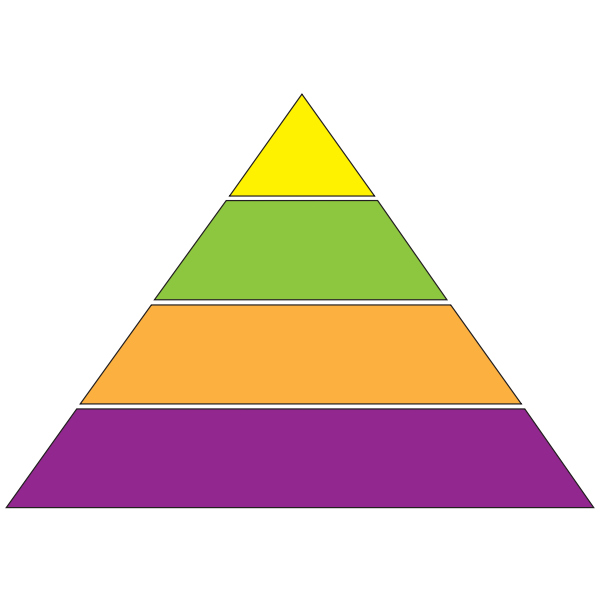
A pyramid chart is used in business to visually represent data in a way that is easy to understand. As we mentioned, the pyramid chart comprises a series of stacked bars, with the bar at the top representing the total and each bar below representing a percentage of the total. This makes it easy to see how much of the total is made up of each part. As a result, businesses can more easily understand their strengths and weaknesses and where they should focus their efforts to improve their performance.
Pyramid charts easily compare data between different groups.
The pyramid chart is used to easily compare data between different groups and see the difference between the data in each group. Since the pyramid chart is divided into sections, from smallest to largest, the data in each section is compared to see the difference between the groups. Having a way to visually compare this data allows businesses to quickly and easily see what areas they need to focus on for their sales or marketing.
For example, if a business is looking at their pyramid chart and they notice that the section for people who have made a purchase in the last year is significantly smaller than the section for people who have purchased in the last month, they may want to focus on increasing sales in the last month category. This would help them increase their overall sales numbers and make more informed business decisions.
A pyramid chart is used to display the hierarchical relationship of a data set.

A pyramid chart is used to display the hierarchical relationship of a data set. The width of each bar on the chart is proportional to the value of the data it represents. This way, businesses can show this hierarchical data to visualize the different levels of importance. The bars can be clustered together to create a more compact chart or spread out to show more detail.
For example, a company might use a pyramid chart to show the different sales levels within the company. The chart could show the different levels of sales representatives, the different products they sell, and the different regions they sell those products in. This would give a clear vision of how the company is structured and how the different sales divisions work together.
A pyramid chart can show the different levels of a process.
Pyramid charts can also be used to show the different levels of a process. For example, a company might use a pyramid chart to show the different steps in their production process. The chart could show the different machines used in the process, the different workers involved, and the different products that are manufactured. This would give a clear representation of how the company manufactures its products. This is important because it can help the company improve its production process by identifying where there might be inefficiencies.
Compare your business data more efficiently with a pyramid chart.
Overall, the pyramid chart is a great tool for businesses to use when they want to compare data between different groups or compare data points within each group. It is easy to understand and allows businesses to see the difference between the data in each group. This information can then be used to decide where to focus their efforts in streamlining their business processes.